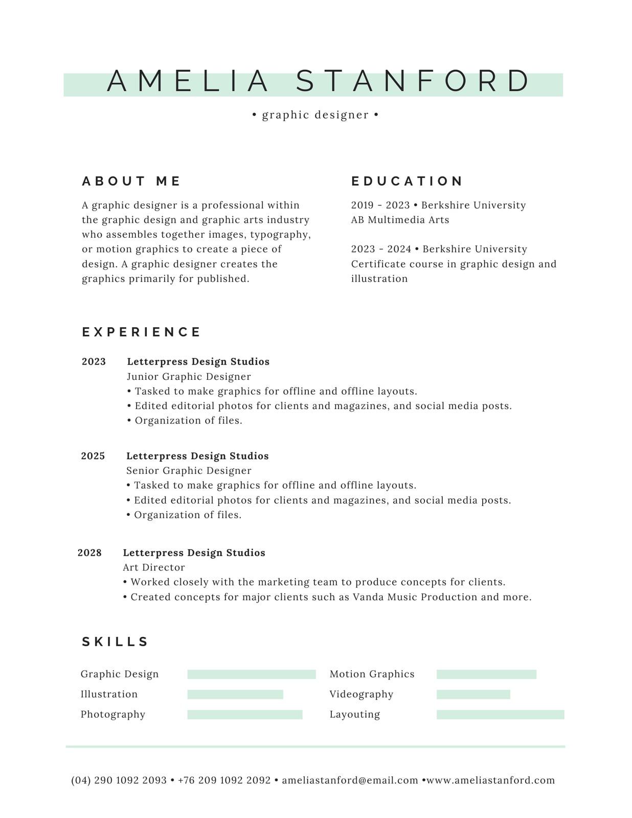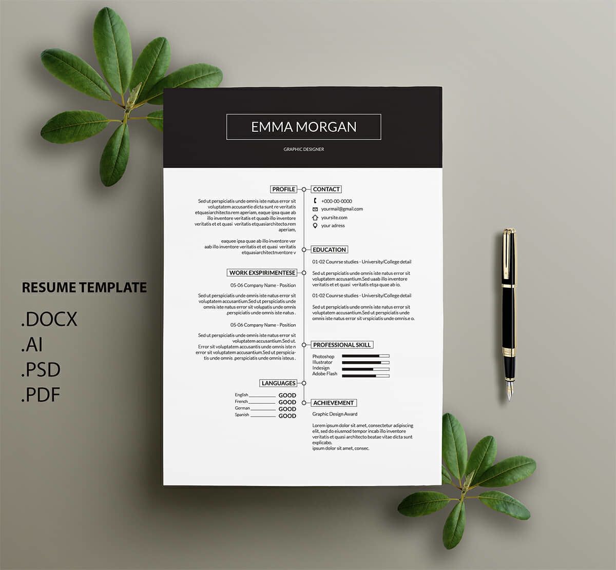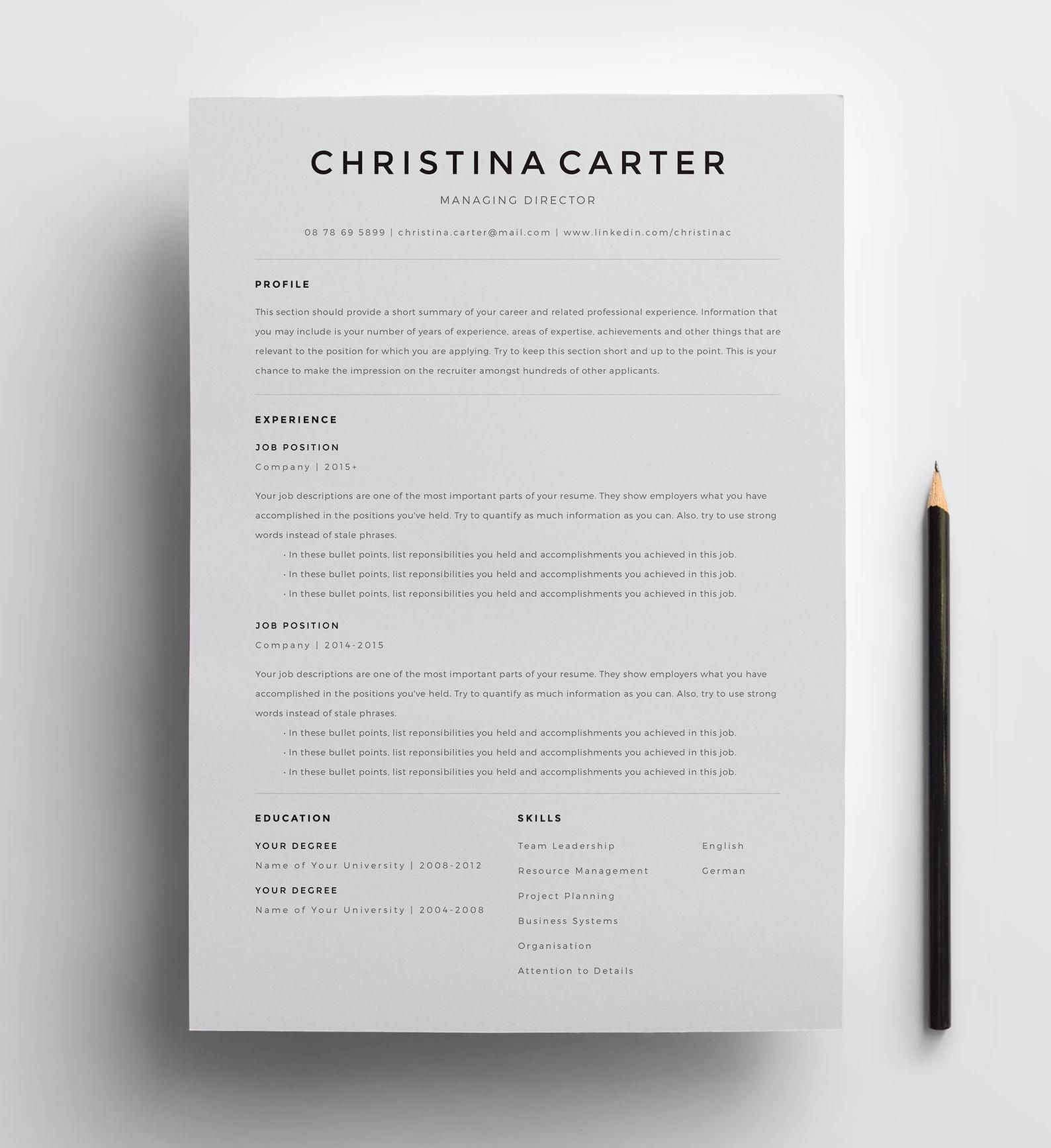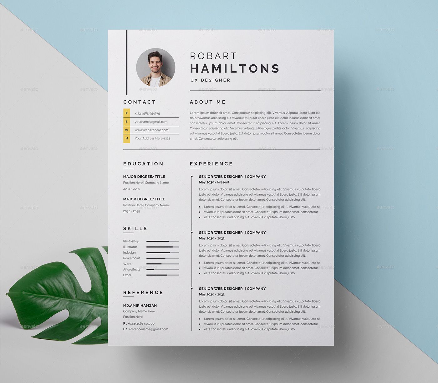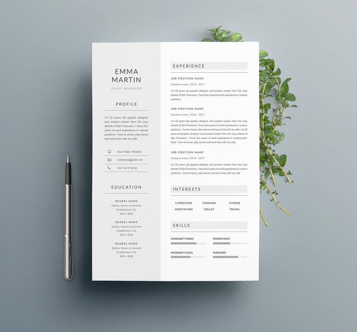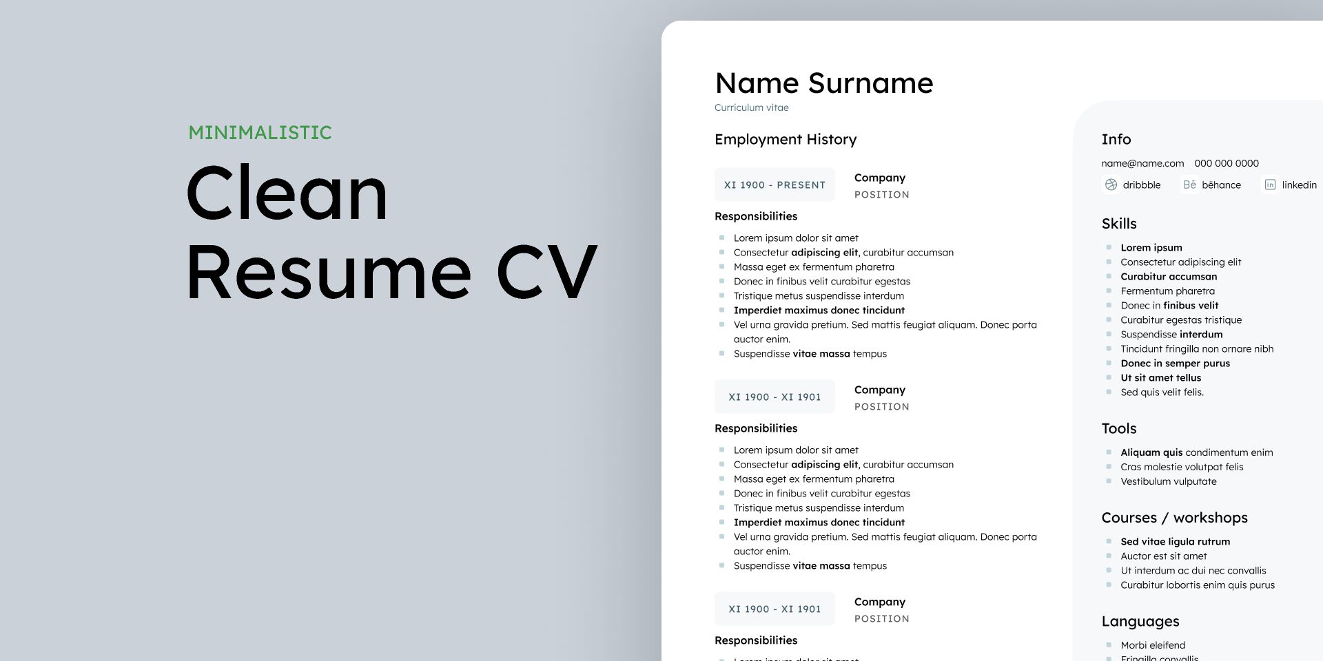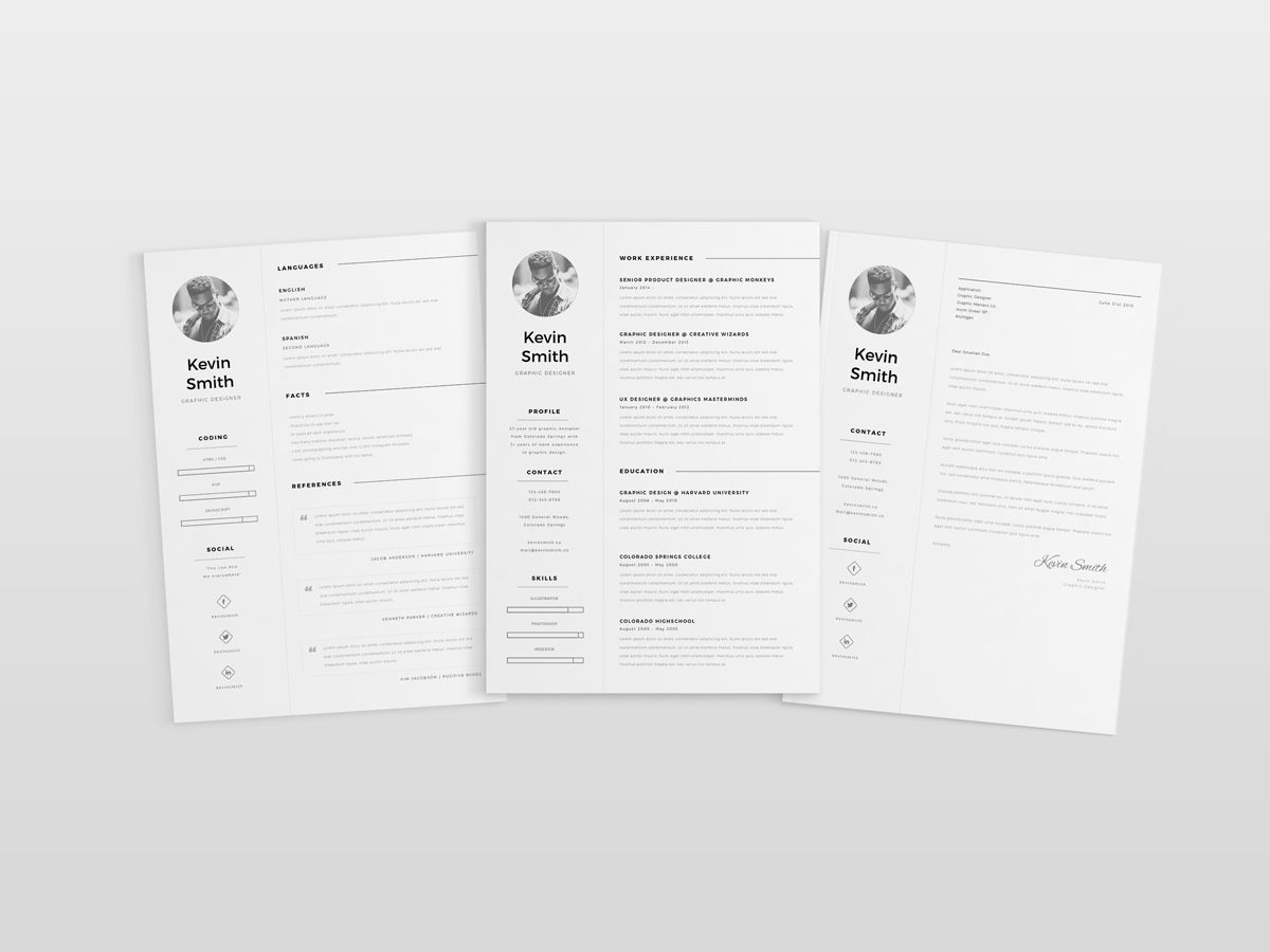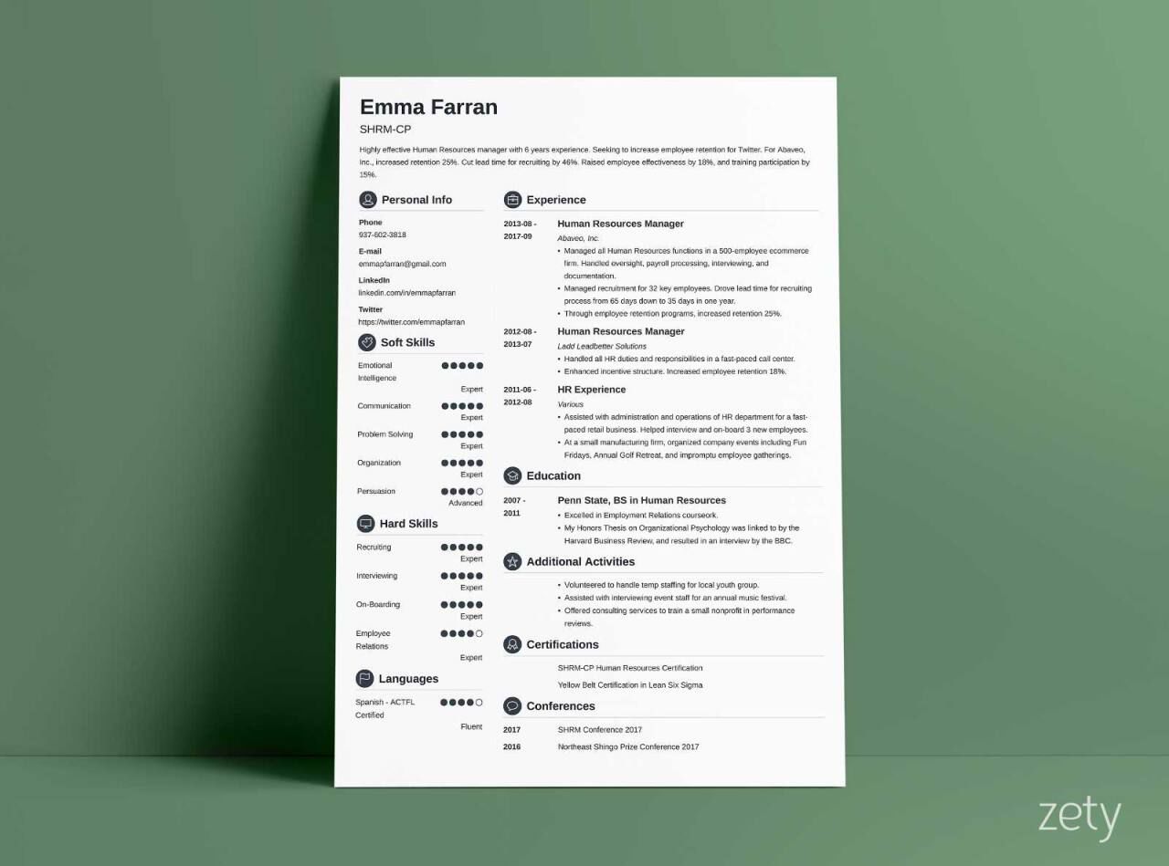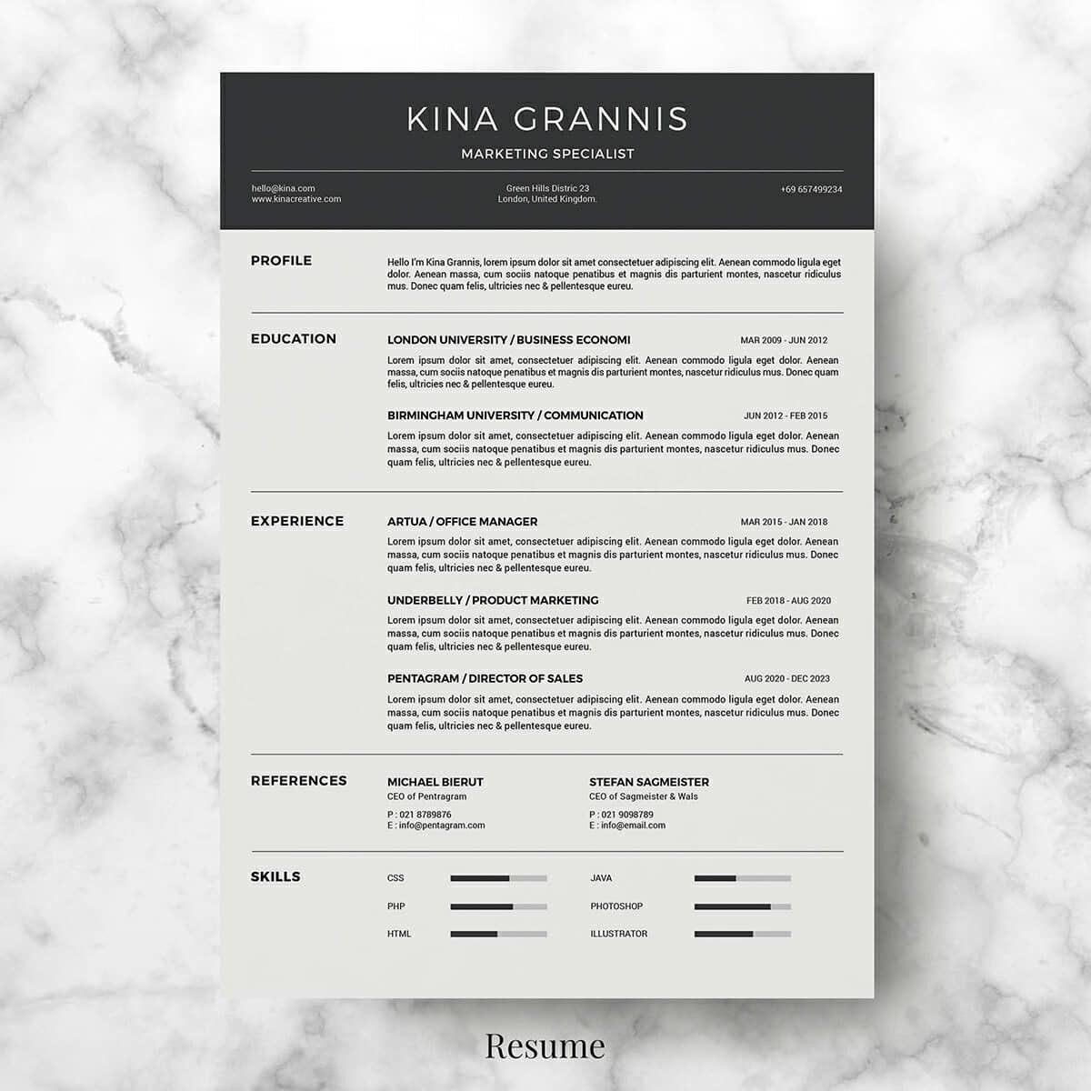
I’ve spent years refining my approach to resume design, and one thing has become crystal clear: less is often more. A cluttered resume doesn’t just overwhelm the reader—it buries your most valuable skills. That’s where a minimal resume template comes in. When I first switched to a stripped-down design, I noticed hiring managers spent more time on my content, not deciphering my layout. The key? Focus on whitespace, clean typography, and strategic hierarchy. It’s not about removing personality but ensuring your qualifications shine without distraction.
Why Minimalism Works in Resumes
In my experience, a minimalist resume isn’t just aesthetically pleasing—it’s functional. Recruiters often scan a resume for 6–8 seconds before deciding whether to read further. A clean layout with clear section headers (like “Skills” or “Experience”) guides their eyes naturally. I once A/B tested two versions of my resume: one dense, one minimal. The minimal version consistently landed more interviews. Tools like Google Fonts’ Roboto or Lato pair well with this approach, offering readability without sacrificing style.
Key Elements of a Minimal Resume Template
Not all minimal templates are created equal. Here’s what to prioritize:
- Font Choice: Stick to one or two sans-serif fonts. I prefer Helvetica for its timelessness.
- Margin Width: 1-inch margins ensure breathing room. Anything less feels cramped.
- Bullet Points: Use them sparingly. I limit each job entry to 3–4 achievements, written in active voice.
- Color Palette: Black and white work best, but a single accent color (like navy or dark gray) can add subtle emphasis.
Tools to Build Your Minimal Resume
While Canva offers templates, I’ve found LaTeX (with the ModernCV package) gives finer control. For non-coders, Adobe InDesign’s grid system is a lifesaver. Pro tip: Export as a PDF to preserve formatting across devices.
Common Pitfalls to Avoid
Minimalism doesn’t mean omitting critical details. I once removed my “Certifications” section to save space, only to realize it was a hiring manager’s deciding factor. Another mistake? Overusing icons. While trendy, they can distract if not aligned with the industry (e.g., a finance resume doesn’t need a camera icon for “Skills”).
📌 Note: Always tailor your resume to the job. A minimal template is a framework, not a one-size-fits-all solution.
Comparing Minimal vs. Traditional Templates
| Aspect | Minimal Template | Traditional Template |
|---|---|---|
| Readability | High (clear hierarchy) | Moderate (often crowded) |
| Customization | Flexible (easy to adjust) | Limited (fixed sections) |
| ATS Compatibility | Good (simple structure) | Variable (depends on design) |
Here’s the thing: minimal resumes aren’t just for creatives. I’ve seen engineers and executives adopt this style with success. The focus shifts from flashy design to tangible results—exactly what employers want.
When I redesigned my resume last year, I cut my word count by 30% but kept every essential detail. The result? A document that felt intentional, not sparse. Honestly, the hardest part was letting go of unnecessary fluff. But once I did, my resume became a tool, not a trophy.
If you’re starting from scratch, begin with a single-column layout. List your top 3 skills in a sidebar, and use 1.15 line spacing for readability. Test it by asking a friend to skim it for 10 seconds—what do they remember? If it’s not your key achievements, revise.
A minimal resume template isn’t about doing less work—it’s about doing the right work. Focus on what matters, strip away the rest, and let your qualifications speak for themselves.
Related Terms:
- minimal resume template free
- minimal resume template word
- free minimalist resume template word
- resume template simple and minimalist
- minimalist resume template word
- minimal resume template free download